
There are plenty of platforms to choose from for selling your own online courses, but which is the right one for you?
From an entrepreneur’s perspective, there’s arguably no better way to build up your credibility in a market and/or niche than by selling your own course on your website.
We’re going to look at three of the top performing e-learning platforms by comparing Kajabi, Teachable, and Ruzuku. Honestly, after examining them in depth, it seems to me that all three of these are great options, but they’re hardly identical.
Read on to learn more about where they differ.
The Basics
As you’re probably new to e-learning entrepreneurship, getting comfortable with a platform should be one of your priorities. The goals and plans you’ve set for your new business direction shouldn’t be held back by an overwhelming platform, after all.While most e-learning user interfaces are fairly intuitive, some aren’t as easy to follow and/or navigate as others.
The good news is, all three platforms we’ll be looking at are well built, clean, and easy to understand. And if you have any problems understanding a certain element, you can hit up their “help” section to get up-to-speed pretty fast.
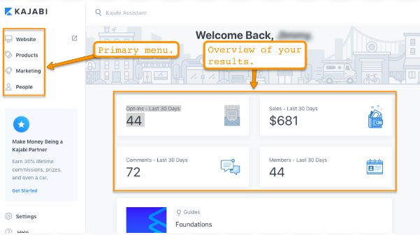
The Kajabi interface is probably the easiest of the three platforms to work with. When you log in, you are welcomed with Kajabi’s dashboard which shows you a quick report of your sales, opt-ins, members, and comments in the last 30 days.
You can also see the simple navigation menu on the left-hand side showing Kajabi’s primary features: Website, Products, Marketing, People.
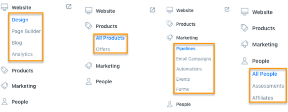
As you click on any of the primary menus, their submenus will appear showing your more of Kajabi’s features.
And if you can’t find something from the navigation menu, you can simply jump to the search bar located at the top of the page where it says “Kajabi Assistant” and type in what you want to do. From there, you should be able to find what you need to get moving.
Moving along to Teachable, this platform prompts you to create a “School” — this is where you’ll house your online courses.
Once you’ve created your school, you will then be faced with this interface.
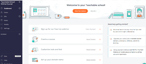
Teachable doesn’t have an overwhelming feel to it either. You can see most of its key functions on the left side of the page: Dashboard, Users, Site, Sales, Emails, Settings.
As you click of these key functions, a submenu will appear with a more detailed list of what the Teachable can do.
Ruzuku’s dashboard is clean, minimalistic, and leaves no room for confusion for its users.
When you log in, this is the page you’ll be greeted with.

As you can see, the one button that pops is the “Create a Course” button (aside from the chat support button on the lower right) — which is the one thing you’re supposed to do when signing up for Ruzuku.

As you create a course, that’s when you’ll see several of Ruzuku’s core functions.
Building Your Online Course
Now it’s time to jump into what you’re really here for – building your own course.While the interfaces do matter, this isn’t what’s going to make you money or prove you’re an expert in your market and/or niche. Instead, it’s your courses that should do the heavy lifting for you. This is your product, after all.
So, let’s jump right into building your own course.
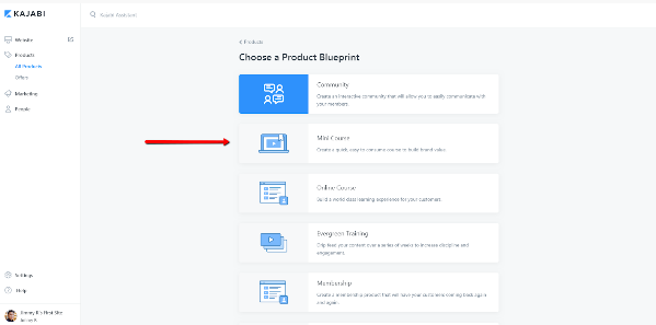
To create a new course in Kajabi, all you have to do is click on the “All Products” link in the left-side navigation and you see the screenshot from above.
From there, you have the option to create a Community, a Mini Course, an Online Course, an Evergreen Training and even an all-access Membership plan. Depending on what you want to do, you’ll have plenty of options to work with.
Because you have a few pre-built “blueprints” to work from, a good bit of the lesson structuring has been taken care of for you, turning your course building into a “fill in the blanks” type of experience.
To show you exactly what I mean, I chose the Mini Course blueprint, and this is what Kajabi brought me.
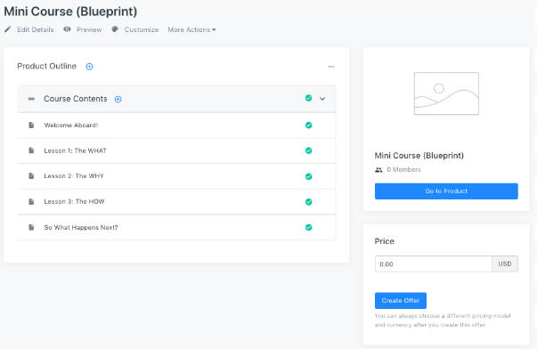
Pretty neat, huh? This is what you’ll see if you click on any of the product outlines. (I clicked “Welcome Aboard!”)
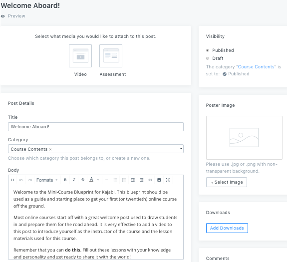
At this point, you just need to add your content in the product outline, price, and thumbnail, and you’re pretty much good to go. This cuts down on your creation time and allows you to focus more on content and marketing your online course business.
Under Teachable’s main menu, you can find the “Courses” option.
Just click the + button beside it, so you can start creating your courses.
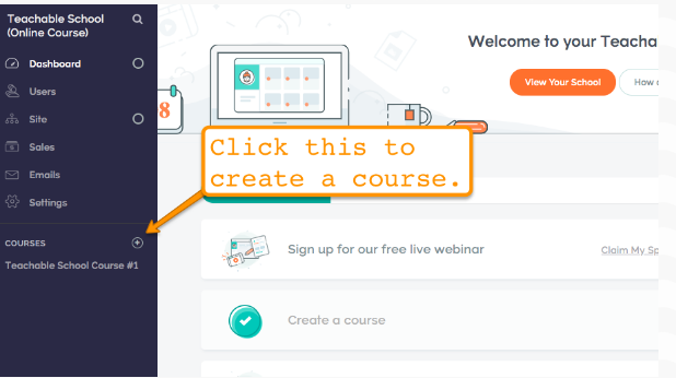
A pop-up will appear, asking you the name of your course. After you name your course, you can start creating your Sections and Lectures. Sections and Lectures are what gives body to your online course.
Sections are essentially groups of Lectures. Lectures, on the other hand, are where your information and content units (e.g., videos, quizzes, images, files, etc.) are stored and published.

If you’re wondering how a Lecture looks from the inside, here’s a screenshot.
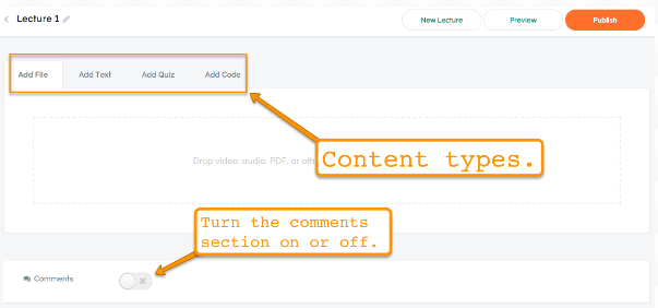
It’s pretty straightforward, I think. It doesn’t look confusing, at all.
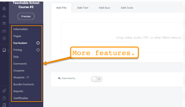
Teachable also has several other features you can use to manage your online course business better.
Ruzuku walks you through the process of creating an online course, step-by-step.
After you name your course, you’ll be directed to start working through “steps.”
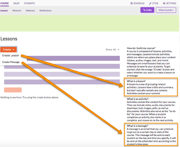
As you can see, after clicking the “Create” dropdown, Ruzuku gives you the option to create a Lesson or a Message. To help you understand what the platform means by both, you can immediately see a description of Lesson and Message on the right side of the page.
From there, you’ll start creating activities, coursework, quizzes, and tests.
The interface designer is built on a “what you see is what you get” (WYSIWYG) editor and it’s also fairly easy to use. If you’ve ever used Microsoft Word or WordPress, you’ll love the simplicity of the designer.
Sales Page Creation
The overall quality of your sales page can easily spell the difference between the success or failure of your online course business.With a compelling and carefully crafted sales page, you can influence countless people to take action on your offers, or immediately sign them up to your online courses. If your sales pages are lackluster, however, your would-be members will only ignore your offer. That’s why it’s so important to check out what each platform has to offer when it comes to creating sales pages.
Kajabi’s sales pages look clean and professional.
They give their users a good level of control in terms of adding (or removing) elements from their sales pages. (e.g., they can remove menus, headers, etc.)
Here’s how Kajabi’s page editor looks.

As you can see, there are several elements you can add in your sales page without you having to code. You just need to click the options on the right so you can start adding and tweaking objects and sections.
The fact that you can remove the menus and header on the page is crucial, since having those elements can potentially distract your would-be customers, thereby reducing your sign-ups.
What’s more, you don’t even have to create your sales pages from scratch. Kajabi has several professional-looking templates or presets you can use, so you have only to add your content in the site and not have to tinker too much with layout and color variations.
Teachable doesn’t have a feature specifically for sales page creation — it just allows you to create new pages.
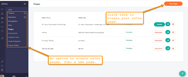
When you click the “New Page” button, Teachable will lead you to their page editor so you can start creating your sales pages.
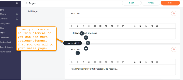
Teachable also allows you to remove other distracting elements from your sales pages like your page’s footer and navigation bar.
Teachable doesn’t have premade templates, however, so if you’d like to create a professional-looking sales page, you’d have to spend quite a bit of time building everything from the ground up.
Out of the three platforms, Ruzuku’s sales page creation process is the most simple. After creating your course, you just need to go to the Sales menu, click Sales Page, then start creating your page.
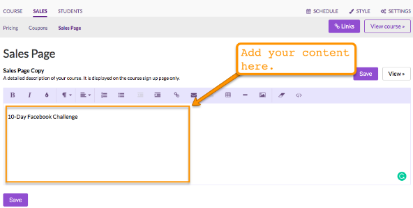
You can also change the style of your sales page like your color scheme, typography, course logo, etc. Just click the Style option on the upper right part of the page.
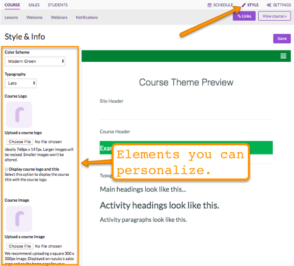
Ruzuku doesn’t have premade templates or standalone blocks of elements that you can use to create your pages — this makes the process of creating a sales page a bit more time-consuming, since you’ll have to create everything manually.
Summary
To cut the long story short, while all three platforms can certainly help in building your online courses, each one still still has its strengths and weaknesses.Kajabi’s lowest tier package is more pricey compared to the other two platforms. However, Kajabi’s platform is has the highest levels of “usability” while at the same time offering the widest array of features, with its comprehensive website builder, product creation, audience management and marketing automation tools. Since this guide is primarily about online course creation, Kajabi deserves a special mention due to its product blueprints.
The process of building and launching products on Teachable is a bit drawn-out. What you can accomplish on the other two platforms in just two or three steps, you’d have to take three or four steps to do in Teachable. The good news is, Teachable has the most affordable pricing package among the three platforms, with $29 for its lowest-tier package.
Ruzuku comes up lacking in functionality when compared to the other two platforms. On the other hand, its simplicity means that it’s extremely easy to use.

If you don't want to get yourself into Serious Technical Trouble while editing your Blog Template then just sit back and relax and let us do the Job for you at a fairly reasonable cost. Submit your order details by Clicking Here »


Post a Comment
We have Zero Tolerance to Spam. Chessy Comments and Comments with 'Links' will be deleted immediately upon our review.