Yesterday, we talked about creating the perfect landing page for your site. Landing pages are an essential tool for funneling your sales, and search engines encourage webmasters to implement them. A good landing page has original and relevant content, provides value to the user, and isn't a barrier to information. It is NOT a place you can simply put a call-to-action in. Carrying on with our last post, today we'll share some inspiring examples of good landing pages.
Remember: A landing page can be any page a user lands on. It can be the homepage, a sign-up page or any content page - it doesn't necessarily have to be a pop-up, although you can take inspiration from these designs to create pop-ups as well.
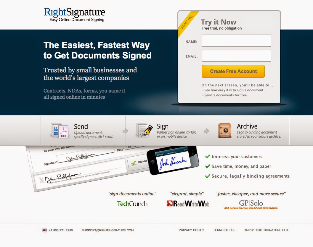
1. RightSignature

This one has got it all. A nicely encapsulated subscription form, a clear-cut headline and relevant information including freebies for added incentive, and high profile testimonials, all in a simple yet elegant design. And unlike some of the other numbers on this list, this one has everything above the fold, which makes it my favorite landing page example for now.
2. GiftRocket

The graphics work is absolutely lovely. A neat and clean design coupled with some powerful testimonials make a bold statement. Second place on our list!
3. Square

Beautifully designed, informative, and hands-on image. The guys at square.com have nailed it.
4. Impact

This landing page is more beautiful than it looks in the picture. It is perfect, except it could do with some more color in the lower half, which is why it isn't in the #1 spot.
5. iPhone App Development

Unfortunately, the website for this one isn't available anymore. But I think it serves the purpose just as well. The features/incentives are clearly defined, there's a nice sign-up form and there's just enough image and video content on the page.
6. SweetIQ

Fill out the form first, look at the content later. A somewhat different approach. I like it...
7. Laura Roeder

This is from a social marketer's site, and I must say it is amazing. It attracts your attention, and holds it long enough for you to learn everything you need to know about it and what it offers.
8. Approach - Beauty

Although not so much of an example as it is a template, I think it still serves the purpose. It was designer by user G10v3 on Themeforest, and we think it is simply amazing. Content rich with simplicity, and picturesque with relevancy, this template approaches beauty like no other.
9. Conversion lab

Landing page with cool transitions. 'nuff said.
10. DrayTek Networks

Got any other great examples of landing pages? Please feel free to share them with us so we can share with others. Peace :)

If you don't want to get yourself into Serious Technical Trouble while editing your Blog Template then just sit back and relax and let us do the Job for you at a fairly reasonable cost. Submit your order details by Clicking Here »

Post a Comment
We have Zero Tolerance to Spam. Chessy Comments and Comments with 'Links' will be deleted immediately upon our review.